Photo Composition
This project was a website focused on the important rules of photo composition because photography is becoming more important and used in web design.
Design
To start the layout I used a basic layout format I created a couple months ago that I can use for any project that has all basic html elements.I made my header with a photo I took in California of the skyline.

 I chose to focus on the rule of thirds, symmetry, point of view, background, depth perception, natural frame, space to move, filling the frame, contrast, avoiding the middle, pop of colors, and breaking the rules because you always need a rule breaker.
 To show examples of the rules I took all of the pictures on my site. Most of the pictures I had previously done before the project. My favorite picture I took was the one I used for breaking the rules.
This is an example of breaking the rules because the subject, my dog, is in the very center and is not following the rule of thirds. It is also my favorite because it's my dog and who doesn't like dogs.
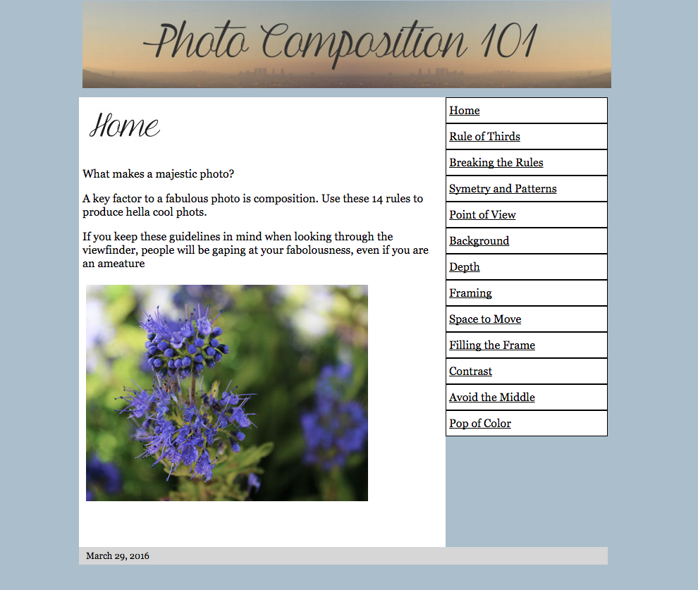
My home page is an introduction to my site and has a picture of a close up of my flower. The picture is an example of filling the frame. The overall look of my site is supposed to be chill. I chose the pale blue because I like the color blue and it is a color that is simple but chill. I chose to use the same font for my banner and header to give a sense of consistency.

The Web Pages


Comments
Post a Comment